Babbler is the first social platform for PR pros and reporters. Founded in 2013, the service aims to redefine media relations in the digital age.
Sector
Startup, Public Relations, Journalism
Challenges
Improve the user experience on the platform and increase active users while creating the UX department, building a team and implementing the UX methodology.
Role
Head of Design & User Experience
Team
20 people based in Paris and New York. Working with communication, marketing, sales, customer success, product and engineering teams. Managing a team of 2 UX/UI designers. Scrum and Lean UX.
Duration
May 2016 - February 2017 (9 months total)
UX Research That Makes An Impact


The Context
The Problem
While Babbler had a good knowledge of its paying customers (PR pros), it lacked insight on its free users (reporters). When I asked what kind of reporters users Babbler was to be targeting, our two product managers told me: « all reporters obviously »…
UX research was greatly needed for our reporter users.
Competitive Analysis
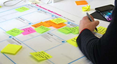
Babbler had no direct competition. Based on a survey we did for the user research, we benchmarked other services users said they were using. We profiled those services; their product, features and audience. It helped us rework on Babbler’s business model with our strengths and weaknesses well in mind. We used the Business Model Canvas. The result helped us prepare the launch of Babbler’s freemium offer.
Research & Analysis Of User Needs
Research Plan
The business objective was to increase the number of active reporter users. While we had to refine our understanding of the needs of the PR pros, the project called for user research to better understand reporters, their needs and how they might interact with Babbler. As the startup was based in both France and the US, our user research had to cover users in both countries.
Findings
Focusing on free users (reporters) was a key parameter for success. Without any reporters, no PR pro would be willing to pay to access the platform. Reporters’ needs appeared to be quite different from the ones of PR pros.
Building Empathy
Reporters
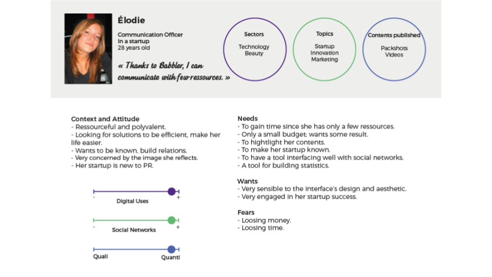
All the data collected through the analytics, online surveys, netnograpy, and interviews were synthesized in 3 personas and their customer journeys. They were made into posters and hung in the offices to keep stakeholders and project developers focused on the user as we made all design decisions. Since the service was quite new in the US, and we lacked resources to perform a real research plan there, we decided to concentrate first on France.


PR Pros
With a striking lack of understanding of our reporter users’s needs, as well as an obligation to prioritize our research effort, we started first with proto-personas for our PR pros users. Based on interviews of the sales team and primary research online, it helped all the team members who were not familiar with real users to have silhouettes of them. When planning a new project or function, it ensured everyone was on the same page.

Prioritizing The Product Roadmap
Recommendations and ideas of improvements emerged that helped our product manager to prioritize. We worked together with the PO, PM and development team to build the backlog. Following the effort impact mapping, the items with high value and low effort were prioritized for the next sprints. The matching system was one of them.

Redesigning Of The Matching System
Defining The Problem
Users did not understand the sector and topic categorization.
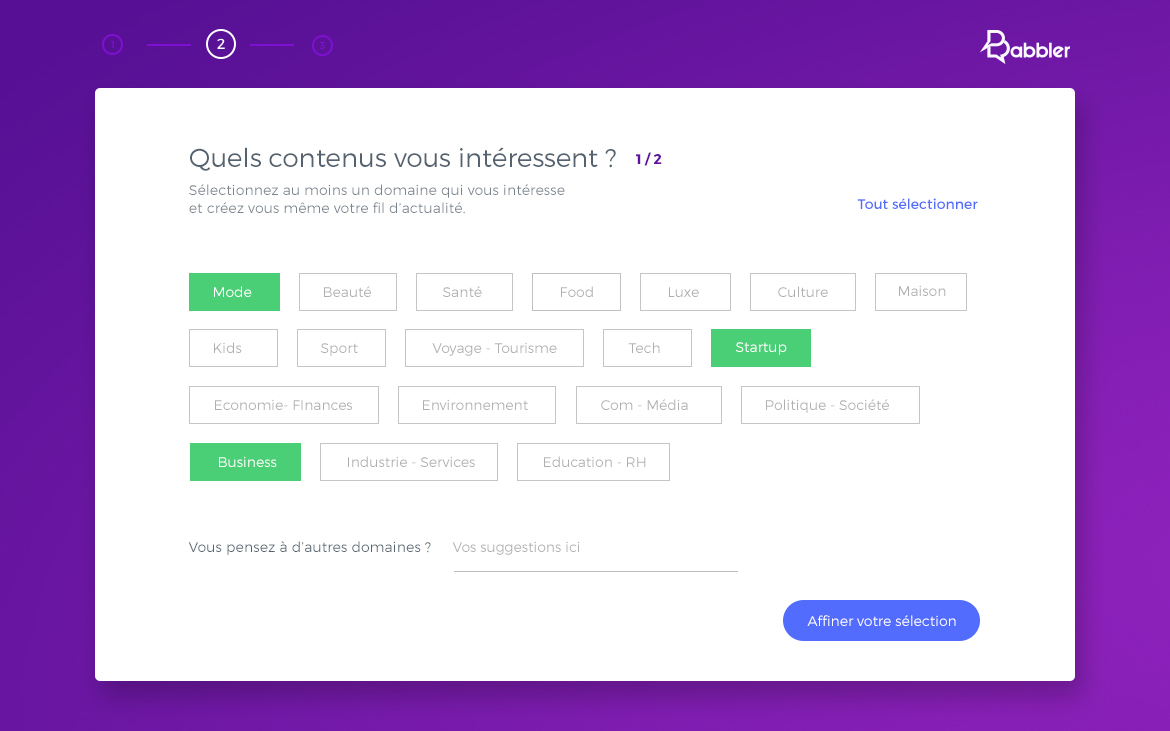
UX Research Showed a Real Need To Rethink the Matching System. Like online dating sites, Babbler matches PR Pros with reporters. When signing up, users choose sectors and topics they are interested in. Babbler matches them with the right followers and content. What our user research had shown, was that the most represented topic among reporters was very different in France and the US. “Other” being the 4th most represented topic in both countries, it appeared there was a real need to rethink the matching system at the onboarding.
Project Goals
- Increase reporter users
- Optimize the onboarding
- Push better targeted content

Sprint Zero
Context
As negative feedback was coming from the US because of non targeted content, the PM pushed for a more restrictive matching rule. A user would only see the contents posted on all of their topics at the same time.
Method
Guerrilla interviews in France, along with ground user research.
Findings
The site had been translated from French to English without a true understanding of the US market specificities. Applying a more restrictive matching rule could well end up with empty newsfeeds. Instead, we needed to understand how users categorized and named content.

Card Sorting
Goal
Review the matching system with a multicultural angle.
Protocol
– Method: Open card sort. In France, 1 on 1 unmoderated sessions with an observer. In the US, remote sessions.
– Tools: Actual cards for our users in France and online card-sorting software (Optimal Workshop) for the US.
– Participants: Reporters and PR pros from our beta testers community.
– Location: The in-person sessions were located at Babbler’s offices.


Steps for the sessions
1/ Preparing the cards
In-person and remote: we listed the most popular contents on the site.
2/ Setting up the sessions
We wrote the instructions, planned half an hour in-person sessions, arranged the conference room, and decided who from our design team would be the facilitator to take notes.
3/ Leading the sessions
We welcomed the participant, showed her the set of cards and the instructions, asked her to talk out loud while working. At the end, we asked the participant to briefly present the results.
4/ Analyze the data
We used an Excel spreadsheet to gather a complete picture of all sessions, show the relationship between cards, and write user comments. We pulled together our findings in a report to share with our team and stakeholders, including next steps for the design process.
Constraints
With limited time to conduct this study during the research sprint, we had only 1 reporter out of 6 PR pros in France. It was more representative in the US (3 reporters and 3 PR pros).

Findings
Benchmarks and workshops with the team allowed us to rationalise the system by gathering sectors and topics into “subjects”. Through card sorting workshops, we discovered reporters and PR pros would rather classify content on a two level system. The first level was global. The second one allowed users to filter and refine more precisely. They mainly used the term “topic” rather than “subject” or “sector”. The matching system had also to be adaptative.

Wireframing

Next steps
We recommended a sprint dedicated to user interests prediction
User Testing
Goal
Evaluate the specific feature being designed, that is the sign-up process, before any development. Identify problems, difficult-to-complete tasks, and confusing language.
Protocol
– Method: 1 on 1 moderated tests, along with session replay.
– Tools: Mouseflow, QuickTime Player, tape recorder, Excel spreadheet.
– Participants: Reporters and PR pros from our beta testers community, along with session recordings related to the sign-up process.
– Location: Babbler’s offices.


Steps for the tests
1/ Participants
I recruited 3 to 5 participants for each specific profile, 1 hour sessions, preferably the same day.
2/ Tasks and script
With a specific feature to be tested, we wrote the tasks and ordered them from the easiest to the hardest to start by making people confortable with the product and process. We established very clear success criteria for each task and got the feature team's buy-in on those. Then we wrote the script.
3/ User tests
1/Pre-test: 5 mins to welcome the evaluator and requalify her profile. 2/Test: For 40 mins, participants were told to do the tasks while speaking aloud, and if they couldn't figure one out in a couple of minutes, they should move on to the next. 3/Post-test: 5 mins to summarize key points, consolidate, debrief and gather feedback.
4/ Report and key findings
We used an evaluation grid, and pulled together our findings in a report to share with the team, with an indication of criticality and some testimonials. We also shared key insights with the team by posting video extracts on Slack.

Constraints
With more ressources, I would have performed remote UX testing for our users in the US, as well as A/B tests. I would have also hired a specialised institute to avoid having to deal with logistics and used a lab, which would allow us to invite the various stakeholders to watch the tests.
Findings
It helped us improve our designs before starting the development sprints. This provided us with hard evidence to convince the team. We discovered uses we had not anticipated. Some users would pass rapidly through the sign-up process. We had to work on the preference system feature for users to modify their topics later on.

The Outcome
Strong impact for the acquisition of sustaining members
”The service is much more fluid now. It's like I had always been using it you know!
A reporterFashion magazine
1300
New reporters subscriptions in 6 months
241
Growth connexion per reporter user
NPS
From 23 to 34 for reporters and from 31 to 41 for PR pros
Learnings
#1- User & Usability Tests Should Be A Must.
When I first started as Head of Design at Babbler, my plan was to implement user tests for every single design sprint, along with the ground user research plan. Unfortunately, lacking the time and resources, I implemented user testing only for some sprints. Looking back, I realize it should be the number one priority for any UX research plan, as it is a powerful tool that provides a lot of immediately actionable information and a big help for evangelization!
#2- Keep It Simple & Fight Complexity.
Reality is complex by nature. As designers we must try all we can to fight complexity, as Rémi Guyot, VP Product at BlaBlaCar says in an inspirational talk (in French I’m afraid…). The idea is to take small steps, because big changes can not be brought overnight. The redesign of Babbler’s matching system was a huge topic with a lot of connected issues I wanted to address. I could have been more efficient by focusing only on priorities. Retrospectively, this might have participated to the perception from the dev team of the design work as being one that slows down sprints…
#3- Documentation & Standardization Are Not The Enemy Of Good UX. We Are.
Most of the time things become standards because they work well. However, standardization should not result in unconsidered design choices and rampant abuse of off-the-shelf solutions. As head of design, I worked with my team on a holistic view of the design system. We started by defining the brand identity. This allowed us to specify a new visual identity for Babbler. Alongside, I started working on a UX repository in order to be creative AND efficient. Unfortunately, laking the time and resources, I had to focus on the delivery work. Still, I remain convinced of the value it can bring in terms of efficiency when wireframing. Building a UX research repository was the next step to be able to document every choice and be coherent in the long run.