Sector
Energy, Customer Service, Call Center
Challenge
Redesign of a CRM with Salesforce. Making sure the +3000 customer service representatives (CSRs) actually use and adopt the tool. As the only designer on the project, I was responsible for the entire user experience.
Role
Product Designer
Team
Core team of 30 people based in Paris. Information Systems Division within a French multinational company (Engie). Working with product, engineering, strategy, design, marketing, customer service, business, legal, solution, and system architect teams. Managed a UI designer. SAFe and Lean UX.
Duration
May 2018 - August 2019 (1 year and 4 months total)
Background
A highly political project with great technical constraints.
Defining the Problem
Need for a better customer management at all touchpoints.
Today, a customer who spends 20 minutes on the web to subscribe to an Engie offer then decides to call customer service to finalise because he can not do it online, is connected to a CSR who has no access over the data the client just entered.
CSRs need a real-time interaction management solution in order to deliver optimal customer experience.


Project Objectives
A simple tool to access customer view 360 and launch cases.
- Less time spent on a case
- Less training
- Simpler customer journeys
Understanding The User
Constraints
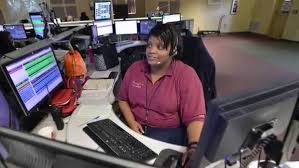
98% of Engie’s CSRs are externals. Unfortunately, due to strategic and business reasons, user research could only be done with internals, who have different work conditions and profiles.
Qualitative Research
With limited access to data and to the majority of our users, I was able to gather insights through :
- Interviews with stakeholders
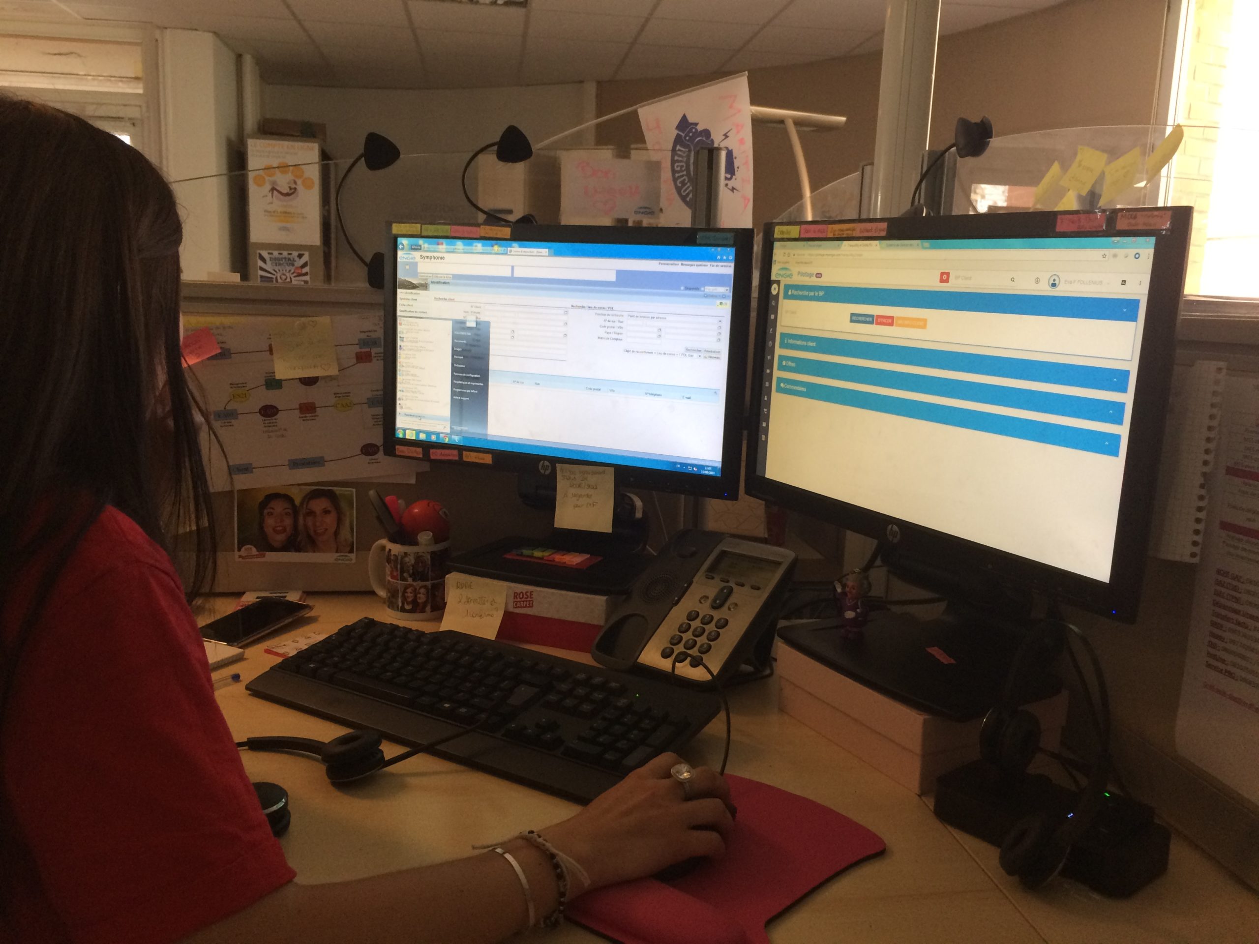
- Shadowings in a call center in Dunkerque
- An empathy mapping workshop with a pool of « key users » from the field

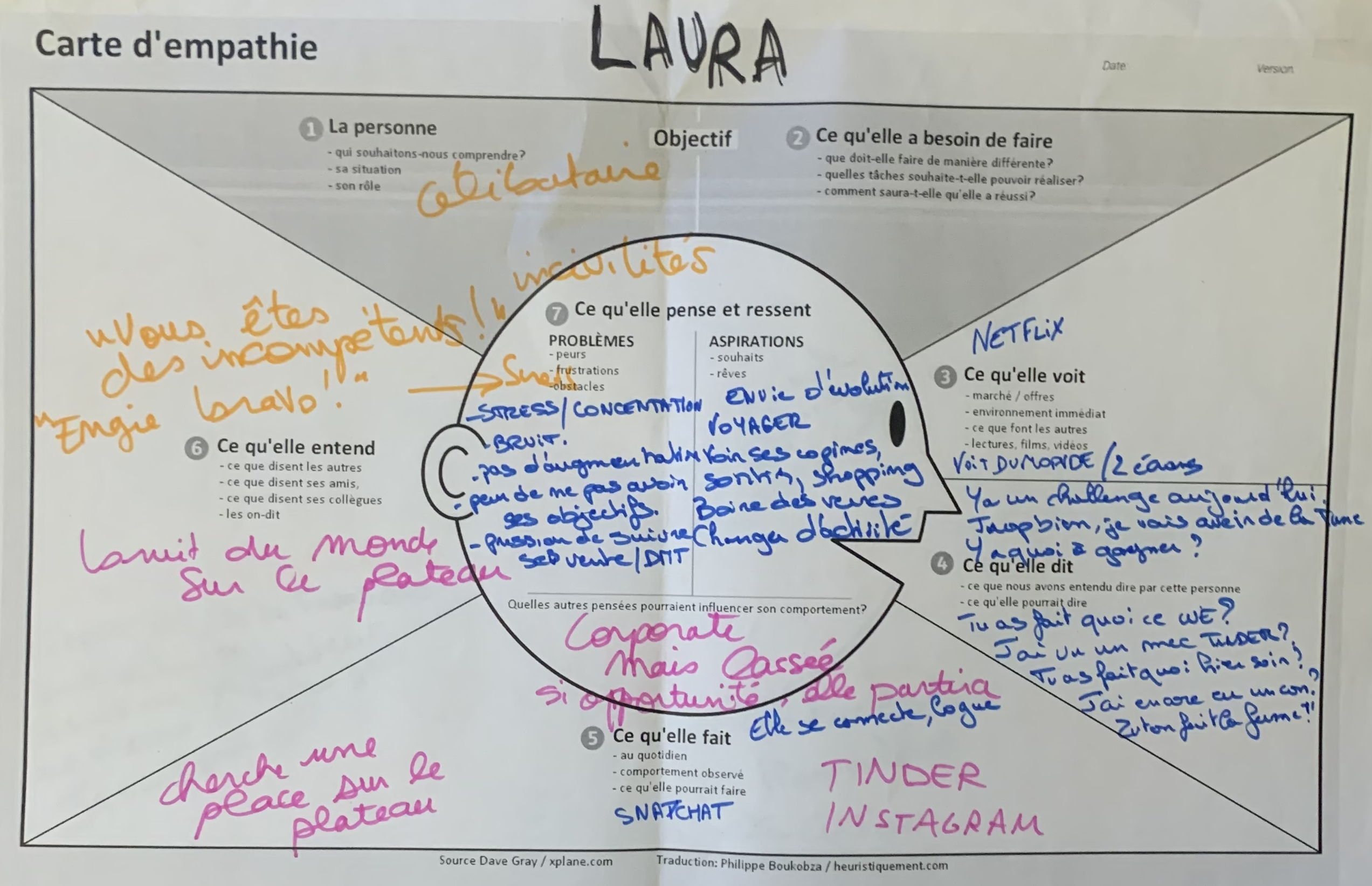


Findings
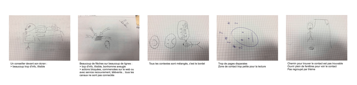
With a strong turnover rate, users need maximum guidance.
There is a strong turnover due to hard working conditions. Floors appear to be very noisy. CSRs have sales objectives which can generate stress. Interactions with customers are sometimes difficult. They also start working with a relatively short period of training.
Users need to be guided when using the tool, as a majority of them are just discovering the job after only 4 days training at best. They need to be very fast at understanding the client, answering the demand, and selling products/options. CSRs' mental load also needs to be reduced to minimum.
Co-designing With Key Users

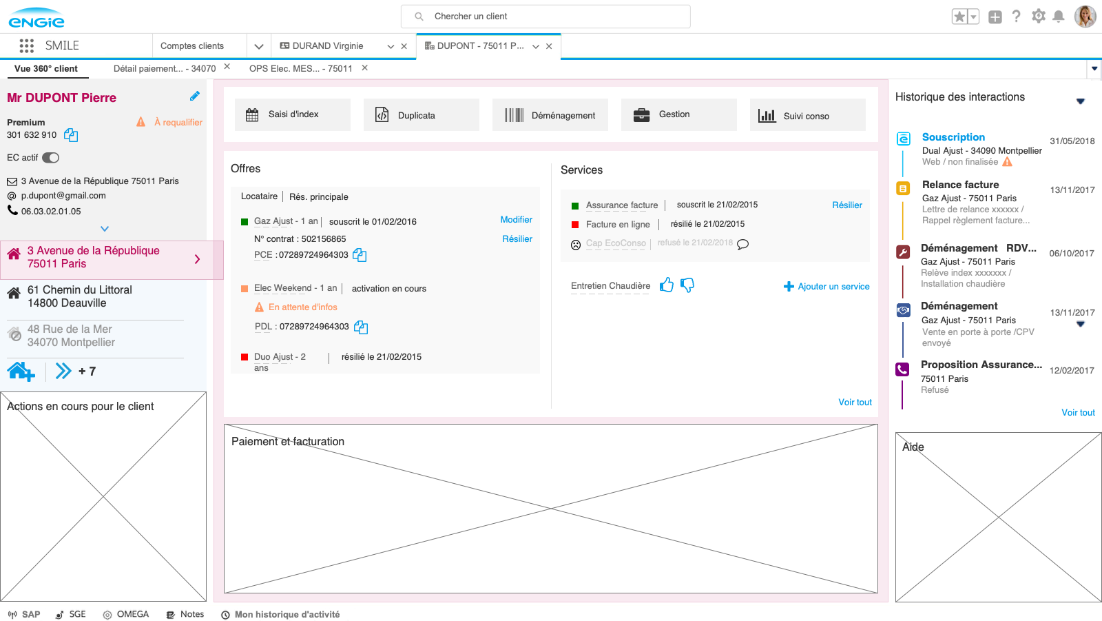
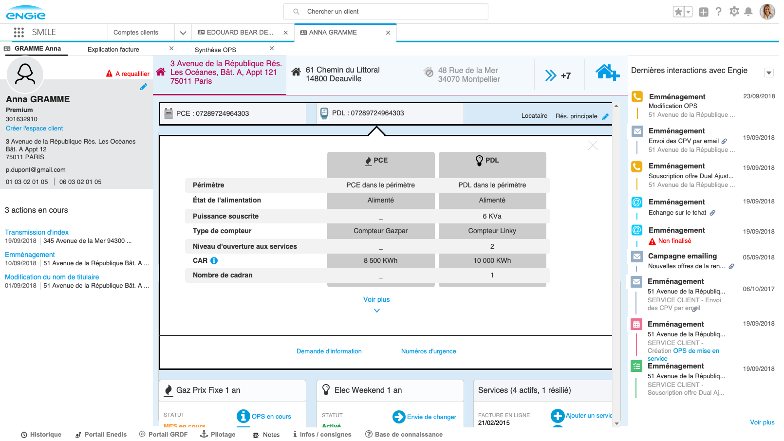
Customer View 360

Constraints
-
No scrolling down into the page. The Customer View 360 had to fit in the CRS’s screen.
-
No hovering to display more information. Only flyouts would allow a quick second level of navigation.
- CSRs needed to be able to comprehend in one sight, without a click, all the important information.
Approach
The fist workshops were about mapping and understanding what blocks the users needed and how they would organize them on the Customer View 360. I gathered zonings of the various mental models. The resulting user insights, coupled with an understanding of technical constraints and usability recommendations, then allowed me to offer a first wireframe that we refined through fast-paced co-creation workshops with the key users.
This led to workshops dedicated to making sure navigation between addresses/contracts was intuitive. By prototyping and testing both solutions (either vertical or horizontal), we validated in co-creation sessions with both key users and technical stakeholders.
Vertical navigation

Horizontal navigation
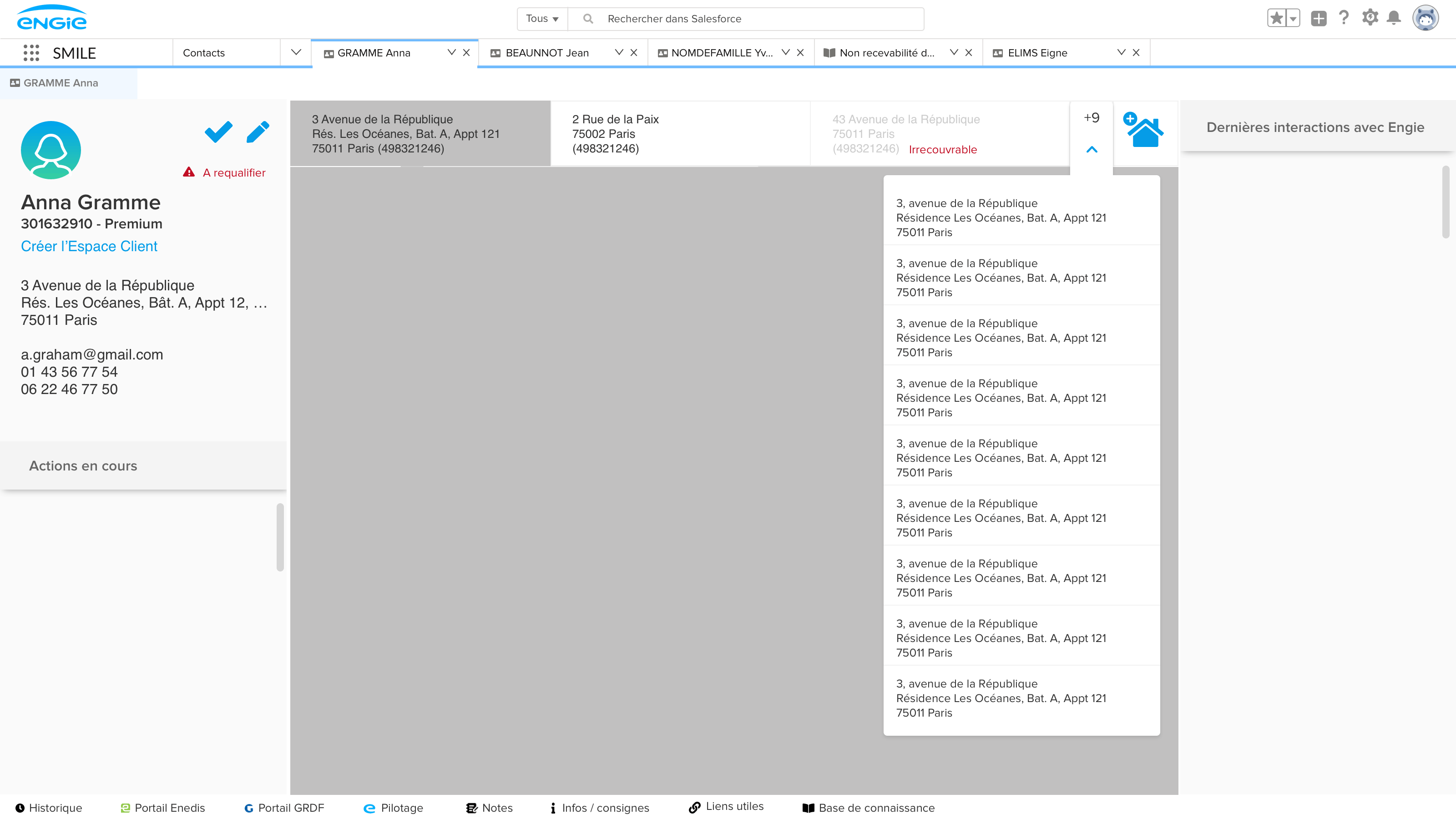
Navigation bar mockup
For each block, a series of workshops with the key users allowed me to design the information architecture structure. For the customer interactions history block for example, I started ideation with a « Draw the problem » workshop to help the key users focus on defining the problem in a clear way and engage them in solving it. An affinity map helped generate and sort the various information. A dot voting helped prioritize and converge upon an information architecture solution for the block. Technical meetings with the solution and engineer teams helped me generate wireframes to be tested by the key users in focus groups.
A flyout allowed us to show more details while staying on the same page. There were important technical constraints as well as great user needs for this feature. Various iterations and testing allowed us to deliver an intuitive and usable solution.
Flyout pushing content

Flyout over content

Flyout mockup
Guided Customer Journeys

Main Principles
- UX steps: identify the client, qualify then process the request.
- Case: the end to end customer request and its processing are held by a case.
- Guided customer journeys: omniscripts lead customer interactions.

Organization
When I arrived, the product team had already mapped, categorized, and prioritized all the various types of customer requests.

I worked on many customer journeys at the same time. For each customer journey, I would organize a UX kick-off meeting with the PPO, the key users, the solution architect, and the technical/dev team to gather insights on user needs, understand technical constraints, align the various stakeholders, and define a UX strategy.
Many workshops with the key users and the PPOs every week allowed me to quickly generate ideas, wireframe, test, and iterate with prototypes.
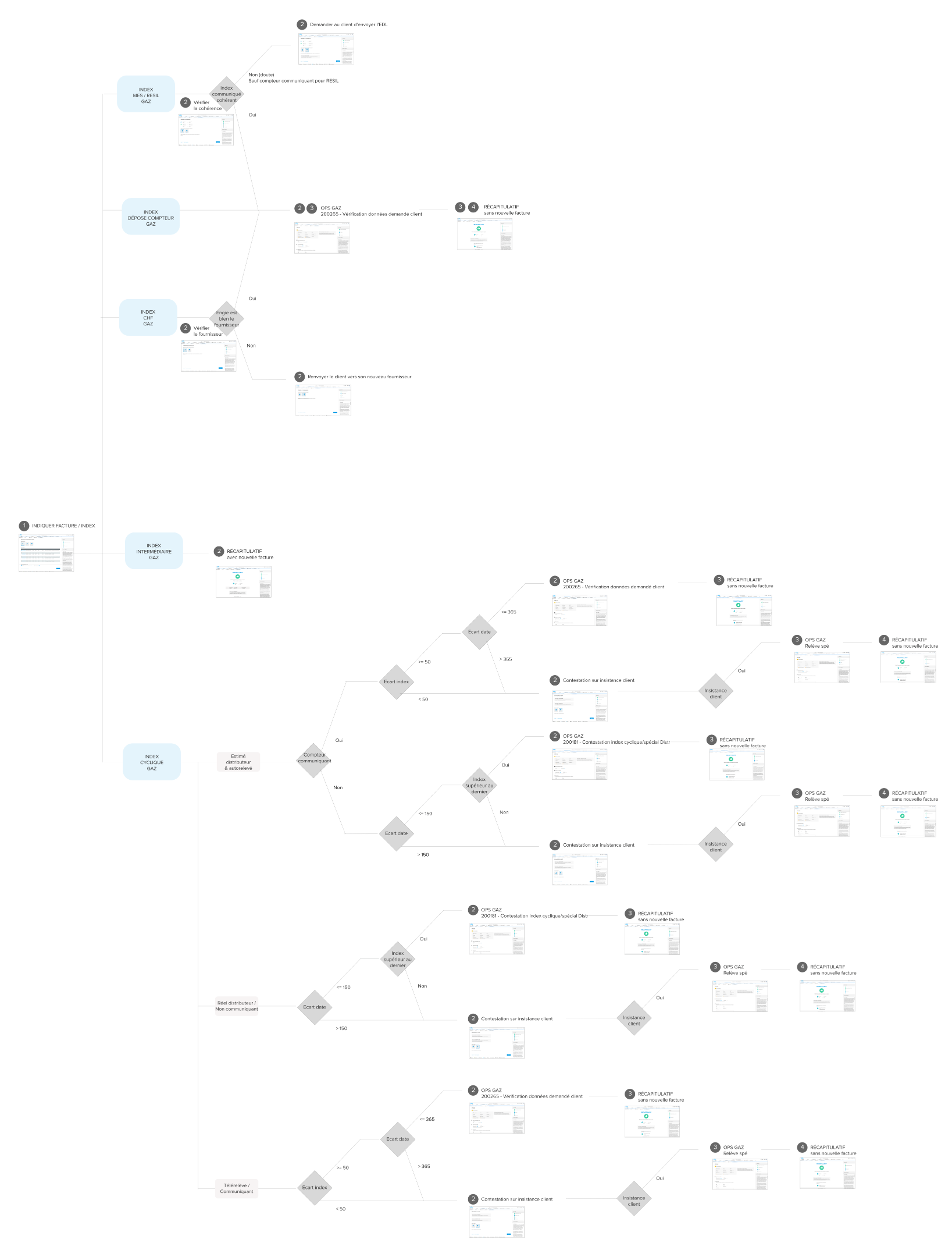
Wireflow for the Index appeal journey
Because we had very high technical constraints and many different interlocutors, I established a technical meeting to get some technical feedback on the prototype before starting the UI mockups.

1st step of the Moving in journey

last step of the Moving in journey
User Tests Before MVP Launch
Objective
Secure the adoption of the tool by CSRs. Coordinate actions and enhance user experience.
MVP validation tests were planned to start in September 2019 with 20 beta testers before the launch for all +3000 Engie’s CSRs. The user test plan was part of the product’s continuous improvement.


Methods
Protocol
Beta testers: 20 internal CSRs from Dunkerque and Metz
Quantitative tools
- UX KPIs tracking to identify painpoints (completion rate, time spent, number of canceled cases, requests for help)
- System Usability Scale (SUS) questionnaire through Google Form, a quick and dirty tool to measure the tool’s usability (learnability, perceived ease of use)
Qualitative tools
- Call monitoring to better understand painpoints
- Click tracking and session replay through Mouseflow to check real uses
- Interviews to understand uses
Action
Constraints
SUS questionnaire: under the pressure of all the various stakeholders to adjust the questions to fit our context, I eventually deleted 2 questions out of the 10. When analysing the SUS score, I realized this was compromising the results. Also, presenting the SUS score of only 20 beta testers, appeared not to be very compelling. Having more participants is important for such a quantitative test tool.
Click tracking and session replay: this was a crucial tool for me since I had to do research remotely and by myself. However, because of technical constraints, we ended up at the very last minute not being able to implement it.
Call monitoring: here also, there were high stakes and big technical constraints I had not anticipated. Had I planned this in advance, I would have been able to implement this high-value qualitative tool sooner.


”I like the graphics. It's very simple to use. You guys are on the right track!
Customer service representativeDunkerque
Conclusion
Having to go on maternity leave for my second child 🐰, I could not implement the MVP test plan myself. Still, it was very successful and has a SUS of +75/100. General launch has been delayed until now because of critical bugs and political/strategic issues. Due to the flawless co-design collaboration, apparently hardly any revisions were required after user testing, neither in information architecture nor in visual design.
As a learning: Make sure to really (I mean, really really) get the expectations of the co-designing group right and to clearly communicate the exact goal of the individual exercises – I thought I did so, but I felt a lack of understanding here and there.
Since I didn‘t know all the technical details of building a CRM with Salesforce, some concepts were way more complex to implement, respectively way more complex to maintain by the client. Retrospectively, I would work more closely with the tech lead. However, I learned a great amount on collaboration with PM/PO/PPOs in a scaled agile framework.